Aquasec Brand Guidelines
Our brand has evolved from Aqua to Aquasec, making our security focus clearer while preserving the distinctive lettering that makes us recognizable. These guidelines help you use our updated identity consistently across every touchpoint.
Our Logo
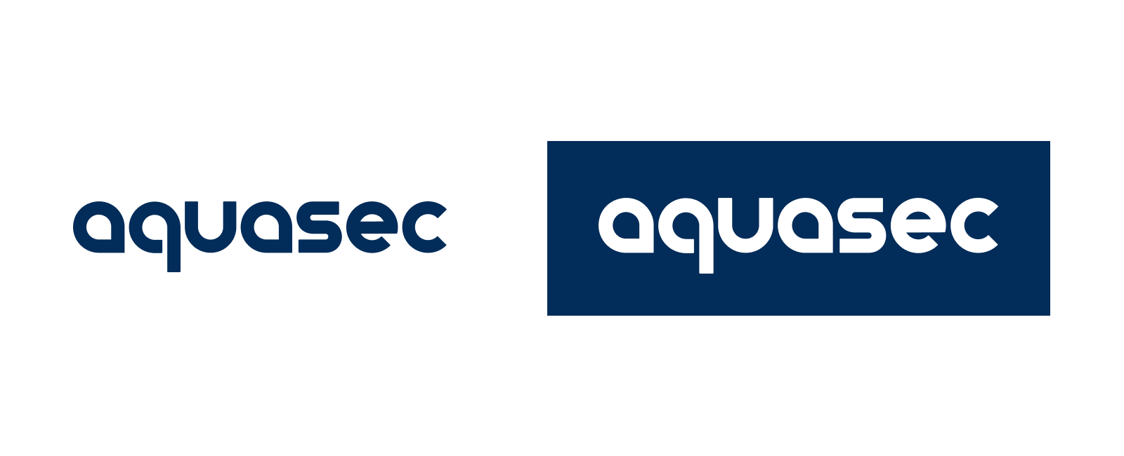
The Aquasec logo brings our name together in a single wordmark, retaining our signature letterforms in a simpler, more streamlined design.
Use the approved dark logo on light backgrounds and the white logo on dark backgrounds. Always preserve its original proportions, letter spacing, and horizontal orientation. Use the supplied artwork rather than recreating the logo with a font.
Use the approved dark logo on light backgrounds and the white logo on dark backgrounds. Always preserve its original proportions, letter spacing, and horizontal orientation. Use the supplied artwork rather than recreating the logo with a font.
Our Brand Colors
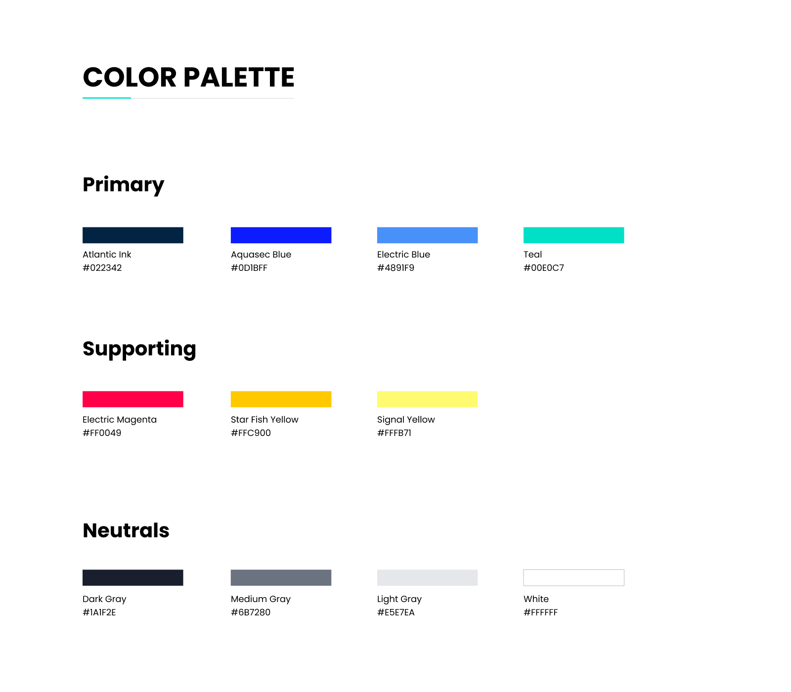
Atlantic Ink is our primary brand color, supported by vibrant blue and teal accents. Together, these colors create a clear, distinctive identity across our digital experiences and marketing materials.
Use the approved color values and combinations provided in our brand palette.
Use the approved color values and combinations provided in our brand palette.
Our Typography
Poppins is our primary font for our website, product, and marketing materials, including eBooks and brochures. We use Regular (400), Medium (500), SemiBold (600), and ExtraBold (800).
For PowerPoint presentations and Word documents, we use Aptos to support compatibility across Microsoft Office environments and help preserve consistent formatting when sharing files.
Download Poppins For PowerPoint presentations and Word documents, we use Aptos to support compatibility across Microsoft Office environments and help preserve consistent formatting when sharing files.
Open Source Logos
Our open source projects have their own distinct identities.
Use the official logo files provided for each project, preserving their original colors and proportions.
Use the official logo files provided for each project, preserving their original colors and proportions.